Tuesday 30 June 2015

30 drawing apps in 30 days - day 21 Inkist

If you watch the video for inkist it looks like the best app yet, it can create custom brushes from selections and tweak almost every feature, it even has dodge and burn!

However my experience was painful, pinch to zoom seemed to work randomly, so much so I went to the tutorial to check I wasn't doing anything wrong...the sliders for the setting wern't visible, and the touch sensitivity for colour picker meant that trying to draw a dot, or small fill switched to colour picking.

See all those straight lines like rain across the image, they are pinch to zoom false detects.
I tried to like it, but in the end I just wanted to stop using it, so I expoted the image to photos, and it even messed that up, inverting the image for some reason.
I feel it's been made to fit the work style of the creator, but it simply was 

I might try a reinstall as I feel it worked so badly, with things like the missing sliders that it has to be a bug.

Anyway
Draw A xylophone was the challenge, so I drew Britain's top Xylophonist Stargazer Sir Patrick Moore.


Monday 29 June 2015

30 drawing apps in 30 days - day 20 Pen & Ink

Using Pen & Ink is a game of "guess what feature is unlocked in the pro version".
I'd be happy to stump up the £2.29 to unlock them, as the app is pretty good, but felt a little bombarded.


Anyway, nicely built app with a range of brushes that allow their colour, opacity and size to be set- using an odd slider system... these settings stay with the brush, so you don't have to reset when swapping between tools.
Undo is hidden under the screwdriver icon, so it's two taps to get to it, which is a bit poor for such a comonly used feature.
Pinch to zoom works without issue, no problem detecting actions as drawing strokes.
Layers are available in the pro version, but I struggled through using opacity and an eraser.
Colours are presets in the basic version, with a better colour picker in the pro version. 
Export is to jpg or png or psd, social media, other apps etc.

Today's sketch challenge was to draw a zebra, which I always think of as a cross horse, perhaps I should do some research next time.


Sunday 28 June 2015

the nog

so I sketched a version of the king of the Lewis chessmen, and scanned it with Adobe Shape, which is probably what it's supposed to be used for... I then added a dash of colour in Art Set...


Noggin

I just found out that Noggin the Nog was inspired by the Lewis chessmen, which is a delight as I think they are cracking characters, and have been toying with the idea of using them in a story.
I drew them ages ago when I was working on the interactive whiteboard common file format...


30 drawing apps in 30 days- day 19 Graphite Lite

I've blazed through most of the "high end" sketching apps, from big reputable companies, and am starting to venture into the area populated by companies I've never heard of. 
Some are truly awful, and covered in banner ads placed to catch your hand whilst you sketch... but this one Graphite Lite, and it's sister app "pen and ink", from stepstone mobile seem well considered and executed.
The Lite version of Graphite is limited to three graphite tools, a pencil, a charcoal stick and a pointy graphite thing... all with fixed widths and sensitivity, and doesn't allow selection of some of the other "brushes" ... however these three and the 2 erasers are pretty good for basic sketching, or tracing over the imported photo layer as I've done here.


The Zoom works well, and there's a proper undo button, the only criticism I have is that I couldn't get a really tight deep gouging pencil line, and had to go over sections again and again to build up the shade, but that may be unlocked with the "upgrade"
The demo version is also limited to 2 sketches, and runs adverts in the gallery- not thankfully in the work area.
It exports to the photo gallery, dropbox, other apps, email, twitter and whatnot.
I'm plesantly surprised by the app.


Today's sketch challenge was "musical"


Saturday 27 June 2015

30 drawing apps in 30 days- day 18 pixelmator

Pixelmator is a full fat drawing app, with layers, more brushes (in infinitely variable sizes and opacities) than you shake a stick at, a wealth of colours, which you can select from hex codes, and the ability to make your own palettes.
The pinch to zoom works as expected, there's a proper undo button, and the only over sensitive touch control is the tap and hold colour picker which gets a bit too helpful if you are drawing dots.
There's a bunch of filters, and effects, and a built in help function.

The only real complaint is that the menu system for picking brushes is a bit too menu-ey, you click the paintbrush, and the the brush type, and then pick the brush, and then click on the size/opacity controls, and then pick your colour... it's a bit long winded.

I briefly used the desktop version of Pixelmator on my mac back when I was doing the weekly webcomic, it loaded quickly, and worked reliably, but didn't work any better than Photoshop so I reverted to that. I can see pixelmator on the ipad is probably much like that, it's fine, but if you are already settled using sketchbook or something else, you are unlikely to switch, unless you are a big fan of brushes, which it has in abundance.

Today's challenge was to draw cords, so I opted for a Geography teacher on a field trip..

Export to png, jpg or psd, save to photos, open in another app etc...
I was slightly concerned when I started the app that it would be a memory hog like Artset, as it warned me I only had 1Gb of memory free on my iPad, but that doesn't seem to have been an issue.


Friday 26 June 2015

30 drawing apps in 30 days- day 17 Moleskine, a creative cloud connected app

This app does sort of the same thing as Adob Shape, except in a really clunky, and bad way.
I found it listed in the extensive set of offerings in the Adobe Creative Cloud app, which acts as a little app collection.


It lets you take a photo of a pencil (or ink)  sketch 


and then applies some filters,  to find the keylines which it then converts it to SVG, 


and saves the result to the Creative Cloud Library.
Unfortunately the default settings means it also tries to do some useful 'optimisation' which are pretty hopeless.


The worst of the auto correction features are the Alignment and Perspective fixers, which aren't smart enough to handle even a simple very stark image like the one I used.


Outputs do get saved to the Creative cloud library, which is neat, but this is a pretty poor tool compared to Adobe shape, which offers far more control.

Anyway, tomorrow it's back to proper sketching apps.


Thursday 25 June 2015

30 drawing apps in 30 days- day 16 Adobe Shape CC

Adobe Shape CC... see if you can guess what it does?
No.
You are wrong.
The idea is to create a shape, I've no idea why you'd do that, perhaps you'd add the output to your Creative Cloud Library and use it elsewhere...
Anyway what is does is allows you to take a photo of something and then filter the image into dark and light, which it converts to some form of vector image.
So in this case I drew a sketch doodle whilst listening to the keynote at the conference.
I guess I should have drawn a bolder shape, without shading to make  useful vector image, but there you go... today is a bit of a departure.
By the way the pencil was a horrible smooth conference pencil, and the paper had no tooth, so it was a bit of a grey skecthing experience anyway.


Then I took a photo, using the app...


I adjusted the sensitivity...


Named the Shape... "two"...


and saved it.


...and exported to my image library


There is a Moleskine app that is listed under the Creative Cloud app collection that does something similar too...


Wednesday 24 June 2015

30 drawing apps in 30 days- day 15 Penultimate for Evernote

Penultimate is more of a note taking app than a true drawing app.
It doesn't have layers, but can import an image, which you can scribble on (note scribble).
It has a single pen with nib sizes in 01, 02, 05, 07, and 09, and a range of bold colours.
It has a chisel point highlighter in 02, 04 and 06 - though these numbers are pretty random as far as I can tell, as the highlighter is always far wider. The ink applied with the highlighter is transparent, and building layers and overlaps, even in the same stroke, multiplies the colour intensity.
The Chisel tip seems to angle itself pretty randomly too, though I guess it may take some data from the Jot active stylus it is designed for use with... I don't have a jot stylus.
Zoom function is pretty mad, it is initiated by the familiar two finger pinch, and opens a zoom pane.

The pane indicates which part of the image it is zoomed on, and can be resized a bit.
It works, but seems a bit weird compared to all the other zoom tools I've tried.

The eraser is a single size tip, but seems to take it's cue from the line it is erasing, so highlighter gets removed in sections from the path of the highlighted area... which leads to mixed results.
There is a cut tool which again seems to be a little inconsistent in which bits it includes within it's lasso of truth.


Exports to Evernote as a note, and can send a .pdf to Dropbox, but no real image export.
Overall seems pretty meh when compared to similar tools like Notability, but I guess if you just need to annotate a picture or somesuch it has the bonus of being integrated with Evernote.

Today's picture challenge, was to draw a chair:


Tuesday 23 June 2015

30 drawing apps in 30 days day14 Artset

Artset is the second drawing app @mecurdy uses, and its completely different to inkflow.
Artset is a really full function painting? app... I can't ask Marion how she uses it as she's off for the week, but I reckon it might work well with inkflow as a way of colouring up initial ink sketches, like I used to do inking comics with Manga Studio, and colouring in Photoshop?


I had a go at this last night and it looks ok, though I could have maybe done the initial blackline work better directly in Artset.


So today's challenge is literature.

Artset doesn't have layers, though you can import a picture and paint over it, but there's not separation. It does the usual pinch to zoom, and there's a proper undo button. 
The thing that really distinguishes it is the novel way of managing tools, you get a drawer that holds the last 6 or so items used, which is just like real life, where you may have a box full of stuff, but a job might involve only half a dozen items, and probably a real focus on 3 or 4.

The marker pens have a really good feel, and it's much like using a set of Letratone Trias, but there's little control over the angle of the pen, which is a pain with a chisel tip. The paint feels painty, and splodges well, and I actually felt a bit artistic, smearing highlights and building up the paint. Unfortunately the eraser is like using a mad spatter brush, there's no control, and in the end it turns out easier to just overpaint. Perhaps these issues are addressed in the artset pro upgrade?


Likewise the tools for smudging and the sponge seem to produce the effect of using an airbrush with a spatter cap... weird, though I found the "water" effect made a really nasty "true detective" style background.
The worst thing about the app is the way it handles memory- midway through painting this pic I got an out of memory warning, and checking usage I found Artset was using 866Mb, as I only have 3 pics in the gallery, and it's base usage is 114Mb I can only assume it stores huge amounts of detail, good if you need to undo a fair bit, but awful if it chokes the device. Once you step back to the gallery and reopen the image it is essentially flattened, and all undo history is lost, and the memory used drops off.

Anyway, here's my effort for today, it's Edgar Allen Poe, originally it had a raven pecking at his face, but it looked like some kind of stuffed toy, so I overpainted it.


Monday 22 June 2015

30 drawing apps in 30 days day day 13 inkflow

@mecurdy uses inkflow and Art Set, so I thought I'd best have a try with them.

Inkflow is basic, more basic than the back to basics version of memopad I tried yesterday, in fact it's so basic I reckon I could write a similar app.
In fact I might well have a bash at just that over the Summer, I have the code from the old Becta Interactive Whiteboard Common File Format Viewer app on my Github profile...
Anyway I've already mentioned that I'm actually a big fan of basic apps, that do what you want, and no more, and I think inkflow is nearly there, but maybe misses out to other bare bones offerings  like penultimate, or notability in a few areas.

Inkflow has a pen,
it's a black pen with a fixed width nib, and a lasso tool to select and move bits of the sketch...or delete them instead of an eraser.
Accidentally I also found a long press whilst in the lasso tool provides a function to add text and images or select all of the image


Actually the ability to grab part of the sketch and move it is really quite neat, and offers something many of the other tools don't have.
There's also an undo, and redo tool... and hidden at the bottom there's a drag up palm rest so you can plop your meaty fist onto the screen without it registering.
And that's it... there are additional bits and bobs you can get in the Pro version if you cough up £5.99 which seems a bit steep for a few brushes and colour...
I also found the app gets a bit laggy as the image becomes more complex, which makes me wonder how it stores the data, and how it would cope with all the additional colour data... I need to have a read of the iOS API docs again.

Today's challenge is 'medieval'.


Sunday 21 June 2015

30 drawing apps in 30 days day 12 Tayasui memopad

In its default setup Tayasui memopad looks like a no frills version of Tayasui's sketches app, a pen a pencil a brush and an eraser each with three nib sizes.
There's a line of basic colours to pick, and that's about it.
But actually it's a little more sophisticated if you invest £1.99 for the extras, or test drive them with the useful 'Try 1HR" feature :
-press and hold the colour picker and there a handy colour change tool,
-additional brushes give pastel shades, and roller and a fill tool,
-a greater number of export options allow you to share the results.


No layers as such, but there is the ability to import a photo and then sketch over it. I found this essential in combination with the auto save as a restore function,  essential because a two finger up swipe moves to a new page... and if you do it again you lose the image you were working on.
Luckily the autosave means you can imort the picture back in as if it were a photo...
This is the only app so far that has lost my work part way through... And it was a bit irritating to be honest.

Serendipitously one of the brushes makes a nice snow effect, if you happen to be drawing an Ice planet... 

Draw a walker was the challenge.


Red five standing by.

Saturday 20 June 2015

30 drawing apps in 30 days day 11 Adobe Photoshop Sketch

Nearly didn't spot this amongst all the other Adobe offerings, there are so many, and the titles make it tricky to know which does what.
Adobe Photoshop Sketch should in theory be just the app I'm looking for, but as with many apps, for some mysterious reason it doesn't include some of the functionality I want, in this case a functional layers tool.
The layers tool allows a picture to be imported to be traced over, but it doesn't seem to want to allow further layers to be positioned over the main layer. I usually use a layer for tone, or highlights, or colouring in...
The layer tool here provides a slider to fade between a background image, and the drawing layer. Images can be imported into the layer from the iPad, or from some Adobe market place.
I imported gradient background because I couldn't find a gradient tool... or a fill tool :(

The toolset consists of a pencil, pen, brush, marker and Custom brush and an eraser tool. Each of the tools has a slider in a pop up menu to control tip size and opacity which works well, but not as fluidly as the Autodesk tip controller. Unfortunately the eraser tool seems to be less configurable, and has a sort of wooly edge.
There's the usual Adobe template shape ruler thing, which presumably works well with the Adobe active stylus and slide puck.


Images can be saved to the photo album, or exported to illustrator and photoshop. Images are organised into 'Projects' which are like clusters of sketches and can be shared using the Adobe Behance portfolio offering.

Anyway, today's challenge was to draw a hammer, so I've done a sketch of Thor...


...One more thing... of all the drawing apps I've used so far this one has really hammered the battery on the iPad. It used 42% of the charge over the period of the drawing, and although I probably spent a little more time on this sketch, I don't think it equates to such a huge battery drain.


Friday 19 June 2015

30 drawing apps in 30 days day 10 Notability

Notability is definately more of a note taking app than true drawing app... but it's really quite similar to Paper by 53 and the other notebook style apps.
Very limited set of tools, a pen with a number of fixed width nibs, a highlighter that works in the same colour multiplying way with successive layers as many of the brush tools elsewhere.
The eraser is a bit of a beast in that it deletes the whole "thing" that you tap... I'm guessing each thing is a vector object, and instead of altering it just removes it. There is a clipboard tool which allows an arae to be selected using a lasso tool.
You can zoom in to add some detail, but there are no layers.
Export is not in image format rather as pdf, although you can send a sort of screen shot to twitter.


On the plus side it is super intuitive and you get to grips with it in about 2 minutes, I've used it to capture notes on my course, when we were doing concept diagrams.


Anyway, sketch for the day is draw a network... 


Thursday 18 June 2015

30 drawing apps in 30 days day 9 Adobe Illustrator Draw

Adobe Illustrator Draw is a polished app, part of the creative cloud offering.
It has layers, it zooms, and it has the useful template tool for outlining. The pens size and opacity are set using a drag left or right, and up and down.


...and that's about it simple and accurate.
The undo is a two fingered left swipe which seems to work without issue. The positioning of the shape tool is one of the only tricky things, especially when you try to position the shape template near the edge of the page.

Export to illustrator and photoshop, save to the photo library, or all manner of other places... and because it's linked to creative cloud there seems to be 2Gb of online storage available, and the ablity to share your work with a community using the Adobe Behance portfolio tool. I'vve shared my pic and will follow up on the community and Behance tool some time later.

Sketch today was draw a school... so it's a school of fish.


Wednesday 17 June 2015

30 drawing apps in 30 days day 8 Adobe Illustrator Line

This app is by far the most professional and considered of all I've used so far, as one might expect from Adobe who have been doing this sort of thing for a while now. This app comes as part of bewwildering panoply of apps under the creative cloud banner, and looks like its been designed for the graphics pro on the move... offering an alternative to coughing for a wacom companion tablet, or one of the increasingly attractive Windows touch surface touch things, or whatever they're called.
The Adobe Creative Cloud for mobile approach seems to be to divide the functionality into individual apps, so there's an app that just builds brushes, there's this version of illustrator for folk who want some perspectives, supported by a wealth of grids, and viewing tools, and the neat template/ruler thing, which allows you to pick shapes to use as pen guides.
The app is designed to be used with the adobe stylus (and slide guide) which I think is there as a palm rest? further esearch required.


Zoom works reasonably well, though as per usual sometimes it thinks you are trying to draw a line, leading to additional undoing...the two finger left swipe to undo does work well, and didn't miss a beat.
The lack of fill tool is a bit of a pain, as is the lack of layers... there's a sort of layer thing, but it is really there to allow photos to be used for tracing, it has a level of opacity, but doesn't allow say a background tone to be layed down with a marker, and then have something drawn over the top... unless to draw your background elsewhere.
It could well be that the workflow is to do some tasks in the sister app "Adobe Illustrator Draw".. I'll try that tomorrow.

Sketch challenge for the day was  draw a computer...


Tuesday 16 June 2015

30 drawing apps in 30 days day 7 Wacom Bamboo paper

Bamboo paper is slightly deceptive. I seems like its a very bare bones app, and in some ways it is... no layers, no page zoom, just 3 preset tool widths, and two tools - a pen and a marker in the basic setup, but it does these things quite well, and as a note taking app, or for sketching a design it's quite handy. It also has a number of in app purcases, which equate to additional brushes and "paper" types.


The standard pen is a useful tool, but feels imprecise, and begs to be used with an active stylus.. and offers to connect- ostensibly to the wacom active stylus.
The colour transparency which creates a multiply effect with successive layers would probably work better with the watercolor brush.
Some tools I feel work better due to their simplicity, and I prefer my handy old Wacom bamboo digitiser  over my chunky Cintiq most of the time, but the bamboo brand doesn't mean anything here.

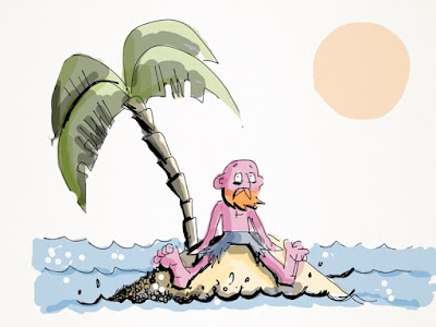
Today's sketch challenge was "water" so I've gone for the old cartoonist sterotype of the castaway.


Sunday 14 June 2015

30 drawing apps in 30 days day 6 - Brushes (Redux)

As mentioned previously the first drawing app I bought on my old iPod touch was Brushes. There was quite a lot of hoohah at the time that such fantastic drawing could be accomplished on your phone, but I found it almost completely useless,even with a pogo stylus . The pogo stylus was at that time the ONLY stylus available, and it was a horrid little stick with a lump of crackly foam on the end.
Despite the hype I dont think many peopl actally produced anything with Brushes.
Anyway, as I'm working through the apps I have I gave it a second look, but this time, on an iPad air, with it's far larger retina screen... and you know what it's not that bad.
It does exactly whatit says in the name, and allows you to create brushes, and as long as you bear that in mind, and use it to paint, with a brush and don't try and draw its fine.


The brush settings are very comprehensive, and it all works quite nicely, there is a bit a gesture sensitivity if you try to do small close strokes, which it interprets as wanting to use the colour picker (the opposite of the problem with Autodesk mobile sketchbook X)
It has multiple layer support,can import and export to a folder ondropbox as jpg, png, native brushes format OR psd, which is useful.
It automatically records the drawing process and turns it into a video clip.
Anyway, today's challenge theme was 'moon' which can't be right... that's no moon...


30 drawing apps in 30 days day 5 - Mobile Sketchbook X from Autodesk

My first iOS device was an early iPod touch and I seem to remember downloading 'brushes' and failing to do anything of any precision on it due to the limitations of the device, the earlier iteration of iOS and my big fat fingers. I haven't bothered even trying to draw anything on a phone sized device since. So today I thought I'd try the mobile version of sketchbook,(and blog the results in the phone blogger app) it works predictably within the limitations of the tiny screen. 
It has 3 layers, which is nice, and the same puck to control brush size and opacity as it's iPad cousin.

The only slight fiddle is the need to relaunch the pick menu after each selection, so pick a brush, open it again to pick a colour or change size.
That said there is a really useful quick colour pick tool, a long press opens a crosshair and means you can switch back and forth quite nimbly. 
As with all touch devices sometimes the gesture recognition fails and instead of the crosshair you draw a line, and then have to open the picker to undo.

It would be worth trying this app with a stylus to get a bit of precision in the lines, but I think you'd have to be quite dedicated to not just use a real notepad and pen... Which of course you could photograph and bring into the app as a layer to be worked up into something fancier. 
The other big downside is that using the app does seem to hammer the battery of he phone, so it wouldn't do for a long day of sketching... I guess it might work better on one of the fatter bigger iPhone 6s? 
So why would you use a drawing app on your phone? 
How about if you were on the train to Yorkshire to see your dear old mum? (You'd use your iPad if you had any sense)